
Summary
Industry Healthcare Services
Device Type Mobile App
OS IOS, Android
Role UX Designer
Challenge Make pharmaceutical delivery service of simpler and more accessible
Design process

Analysis
Assumptions
In the modern world, shipping has become integral to simplifying our lives. Based on the statistics of the development of such a service as home delivery ( the data can be viewed here https://ec.europa.eu/eurostat ), I assume that the application for the delivery of medicines can also be popular and become an integral part of our life since the target audience is any person who needs to buy medicine or products related to pharmaceuticals.
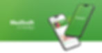
MedSwift is a pharmaceutical delivery application designed to provide a seamless and efficient way for users to access and receive their medications.
MadSwift is an application for fast and reliable pharma delivery. Its user-friendly interface ensures that getting recipes will be as easy as ordering groceries at home or buying a theatre ticket.
The main goal was to create a satisfying and effective user experience by considering the following principles and values during the design process:
Understanding User Needs
Ease of Use
Effective Navigation
Visual Appeal
Personal Adaptation
Feedback and Iterations
Security and Confidentiality
The main criteria that the user needs
After conducting several questionnaires using Google Forms, I determined that more than 78% of respondents are interested in this application. About 34% buy medicines more than once a week, and 44% buy medicines more than once every two weeks. Based on these statistics, this application is cost-effective and can make life easier.
Also, after analyzing such applications and making a reserch, I have identified the main criteria that the user needs. These criteria can be attributed to the scope of the delivery service:

Analysis Main Competitors
I chose 2 competitors and analyzed them based on consumer feedback.
Review we took from https://play.google.com/ . We also put our comments (green, red stickers)

I have analyzed the market of similar applications, we have collected the functionality that is needed for this application, here are its main parameters:
Find the product (search, filter, sort)
Examine the product (detailed product page)
Buy the product (shopping cart, checkout, payment, bonus system)
Receive the product (delivery)
Interview
I conducted several interviews that were aimed at obtaining information about the goals, objectives, and expectations of users regarding the pharmaceutical delivery application. By talking to users, I identified some of the problems and difficulties they face when using the product. This allowed me to focus on improving these aspects to increase user satisfaction. All personal information about the interviewershas been replaced.


In two interviews, Sarah praised MedExpress for its time-saving convenience but suggested real-time tracking improvements. Alex, a PharmEasy user, appreciated the app's reliability but recommended a more user-friendly interface and live chat support. Both emphasized the convenience of home delivery and expressed overall satisfaction with their chosen medicine delivery apps.
User Flow

Prototyping
The client's path begins with a classic beginning: a logo and a welcome promo.. After that, the visitor is asked to create an account or log in to an existing one. Then a window appears with a short slogan and a Start button. I also added the ability to log in via a mobile phone first (is a prerequisite) I have not added any additional actions at this stage to shorten the client's path to the main action.

Next we get to the "Catalog" menu. This is the main menu for finding drugs. Here we can find the product we need, select it by category, determine the type of drug (Tablets, liquid drugs), and also get acquainted with popular drugs or seasonal offers. Also on this screen we leave room for promotions.
We also added the opportunity to get acquainted with each drug in detail, as well as immediately add it to the cart

The next item we have is a list of pharmacies. You can see them in a list or select them on the map. The user is provided with information about each pharmacy from the list, how to get to it and opening hours. We added this feature so that the buyer could compare prices, assortment, and also could guess the courier's travel time.

Cart. Here the buyer picks up his order, sees the final price, the shopping list, and proceeds to checkout. After entering the data and payment, the user can monitor the courier in real time. I tried to make this and prototypes according to a similar structure as other similar applications, so that the client's path was understandable and accessible to him.

And of course the user's personal data. In addition to the ability to edit the profile (general information, location and application settings), here you can also see popular and marked products, information about payment methods (wallet) and previous orders.

Conclusion: I managed to develop prototypes that were clear and easy to use. These prototypes not only provide intuitive interaction but can also anticipate the user's path, creating a more harmonious and satisfying user experience. Additionally, I will continue to improve and optimize the functionality to achieve a high-quality standard and meet user expectations by developing a UI for the application.
I tested prototypes to analyze user behavior, which allowed us to collect additional data to improve the design and optimize the user path. The obtained results significantly enriched the understanding of the needs and preferences of the audience, providing a more accurate alignment of the UX design strategy.
UI Design
The visual design was developed quickly enough without causing certain difficulties. Initially, green was chosen as the main color because this color causes quite strong and understandable associations among users (the design of many pharmacies and medical centers is green, this color is also associated with health, life, freshness, and so on). I decided to complicate the basic green and added a gradient, as well as a grainy pattern so that the color does not look uniform.
The logo is the name of the project.
I chose a simple and clear font to make the consumer memorable and recognizable from the first acquaintance with the offer. Also, the selected icons and visual design elements are simple and monosyllabic (the lines are approximately the same size). I use this technique to get away from unnecessary and unnecessary symbolism, as well as to emphasize simplicity and ease of use.


Actually, color prototypes :)


Video Prototyping
Thanks for watching!